Royalton I · 豪峰
本次的設計風格是以溫暖木質的色調型造北歐極簡風,石材、木質建材相互交織,展現大器奢華的風範,同時不失溫煦感,並運用相異材質、色彩堆疊出豐富的層次感,
而加入一點植物元素,能為居家環境注入活力的力量,打造一個令人心曠神怡的地方。
The design style of Royalton is the Scandinavian minimalist style with warm tones and intertwining with stone and wood materials to show a posh and luxurious design. It values simplicity, functionality, and calmness. The project not only rich sense of harmonious, but also uses divergent materials and colours to create a rich sense of layers. Adding a little plant is a key to making a change to the home environment to be vitality and conceive a relaxing place.
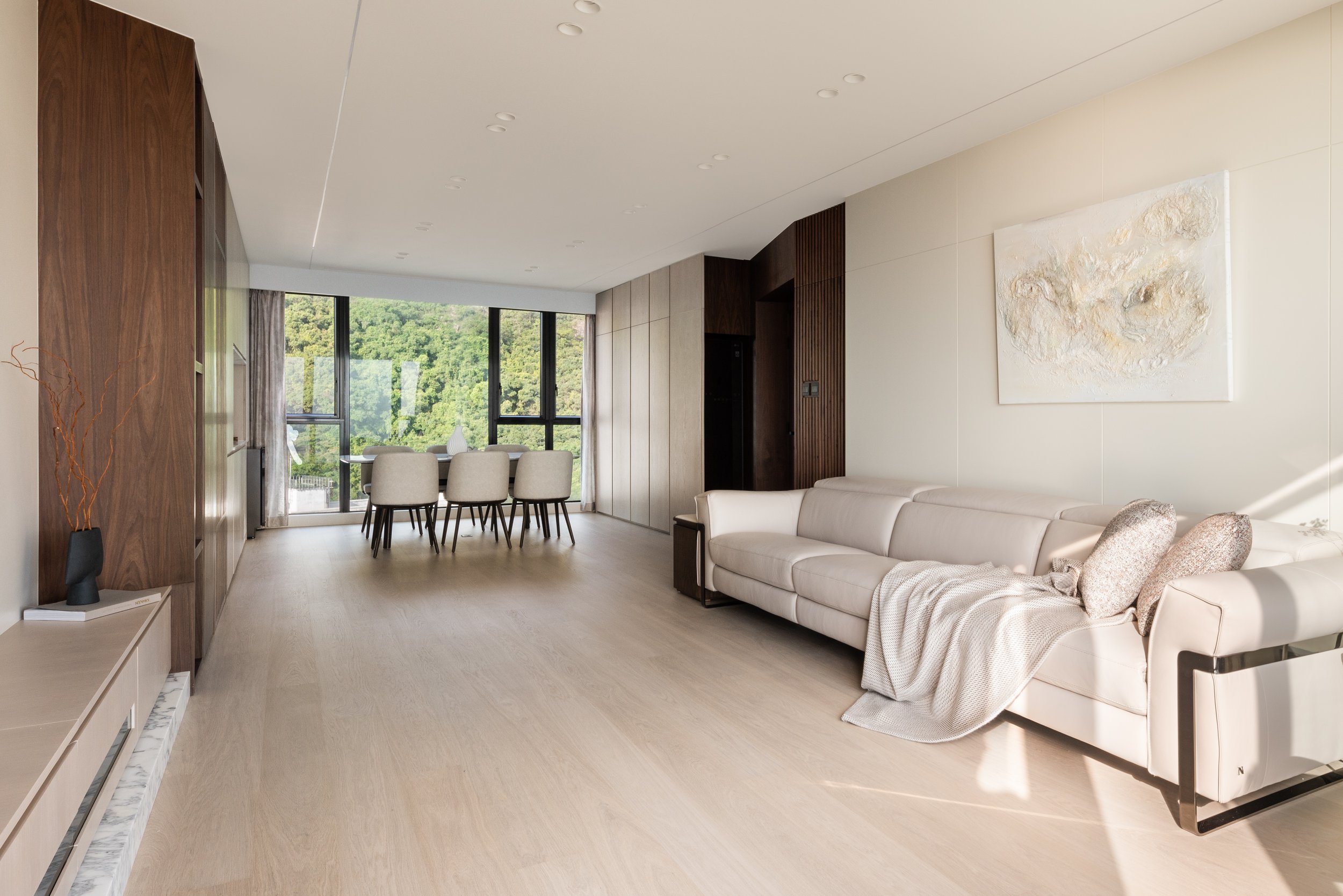
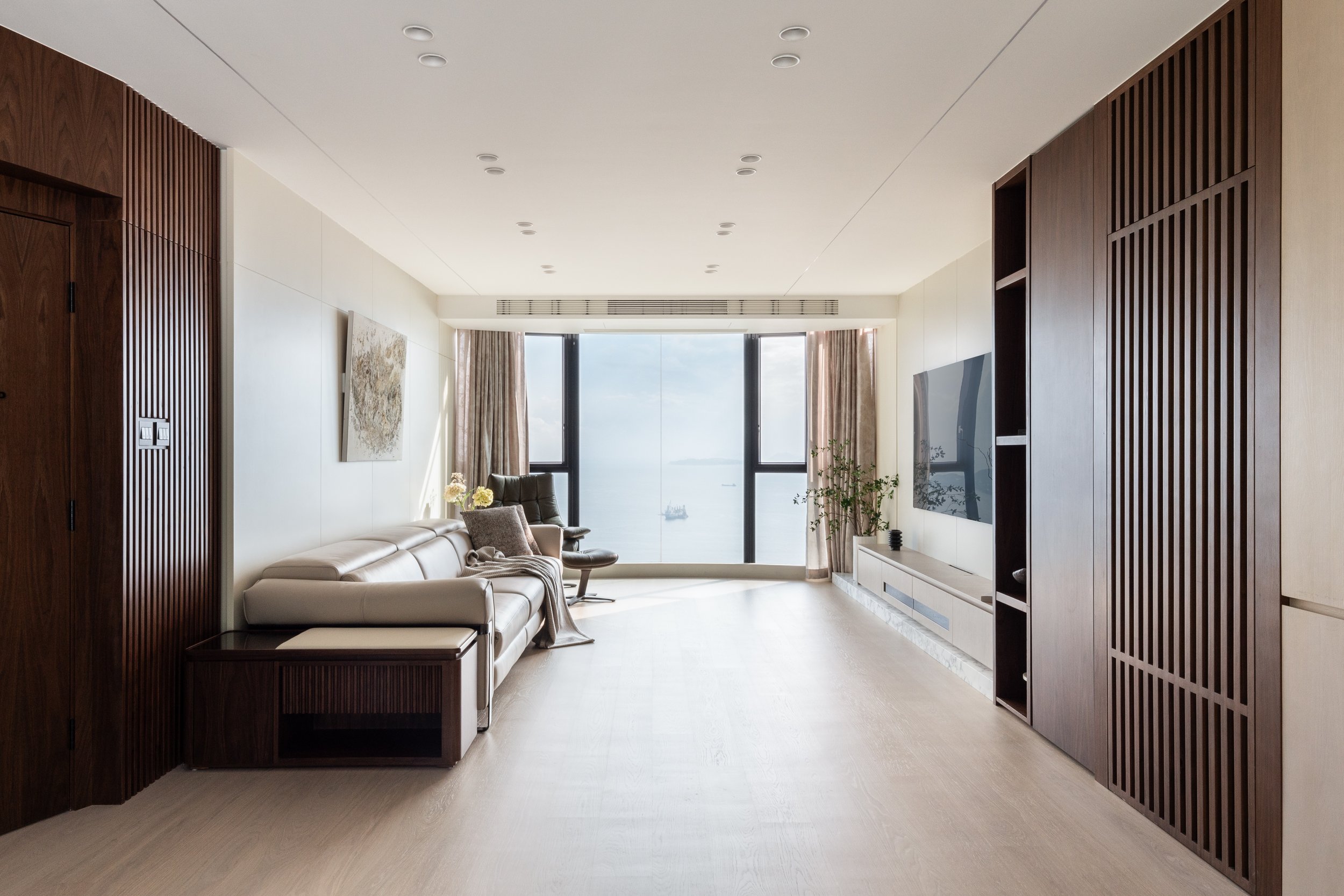
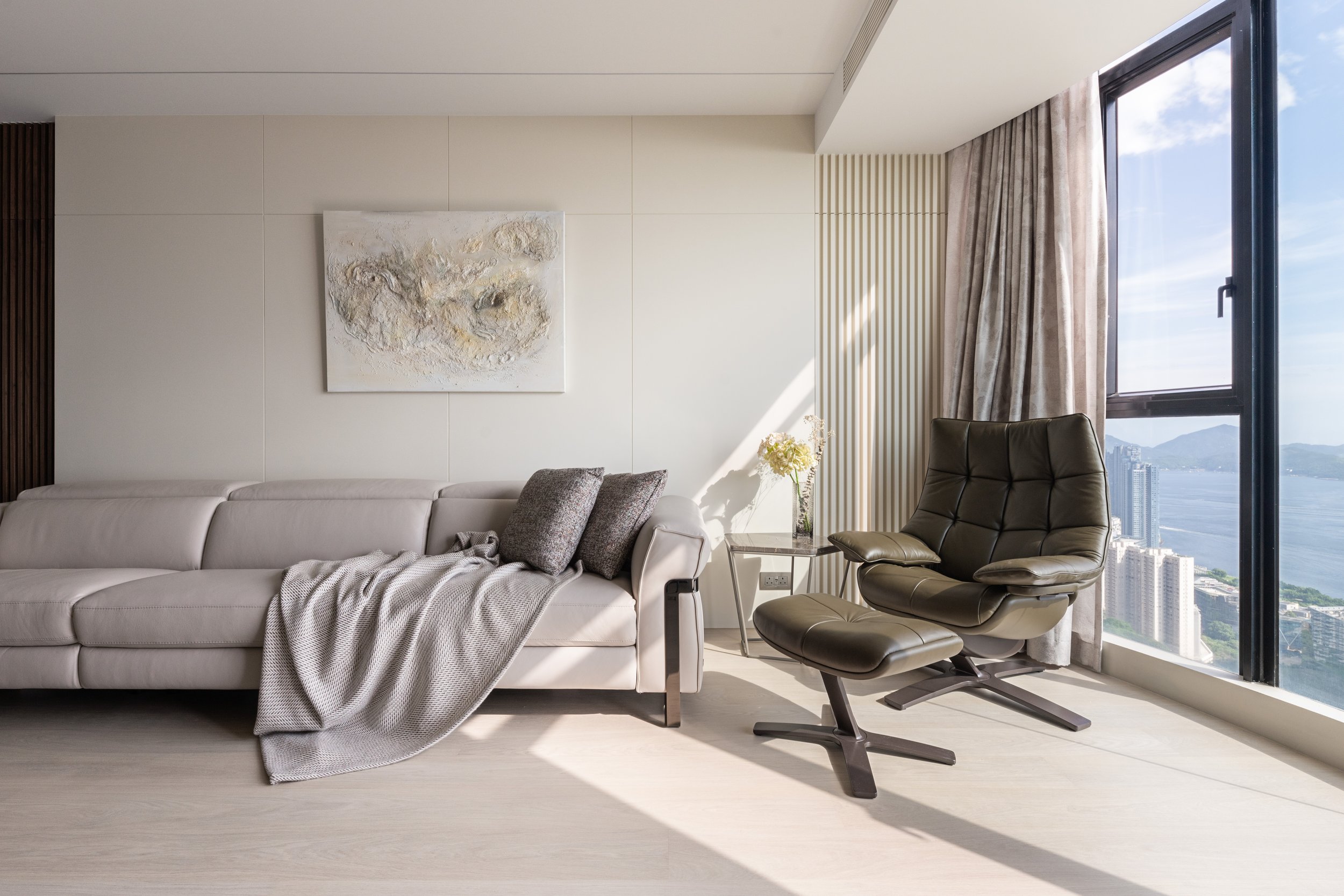
在這次的設計中,設計師為了打造一個和諧的空間,特別在兩邊的牆身應用了相同物料和顏色,從而可以互相乎應。在大廳的設計裏,大門和走廊的門口是以深色的胡桃木和木條子製作而成,特別是大門利用大廈本身原有的結構,創建斜角的門身,不但令屋內空間感更大,並且統一整個空間。另外,櫃子選用了淺色的胡桃木,電視的櫃和梳化的牆身用了米色的油漆,統一的色調令到整個設計更融洽。
In this design, characterized by clean lines, neutral colors, and simplistic decor, every piece in a modern space should be various factors of the design project.
The interior designer used the same material and colour on both walls to discover a coordinated space that corresponded with each other. In the living room, the doorway and the corridor was made of dark walnut wood and wood slats, especially the doorway used the original structure of the building to fabricate a beveled body. That being the case it not only made the spatial perception feel spacious but also unified the charactertics of the whole space. In addition, light walnut wood was used for the cabinets as the main colour of the TV cabinets and the sofa walls were beige paint which was adjacent colour and produced a formal balance design.

客廳與飯廳各陳列著簡約大理石的餐桌和茶几,搭配深啡色的木質材料,傾注一抹細緻的設計質感,同時營造出接近大自然的氣息。而L形的梳化是以聚酯纖維的製造的淺色布料和搭配米白色和深啡色的墊子,傳遞現代極簡的居家風範和方便打理。
The living room and dining room were each decorated with a classic marble dining table and coffee table with bark colour wood that composed a delicate texture and created an area similar to nature. On the other hand, the L-shaped sofa was made of cornsilk colour polyester fabric which was convenient to organise and paired with beige and olive cushions to be conveying an elegant modern design style.
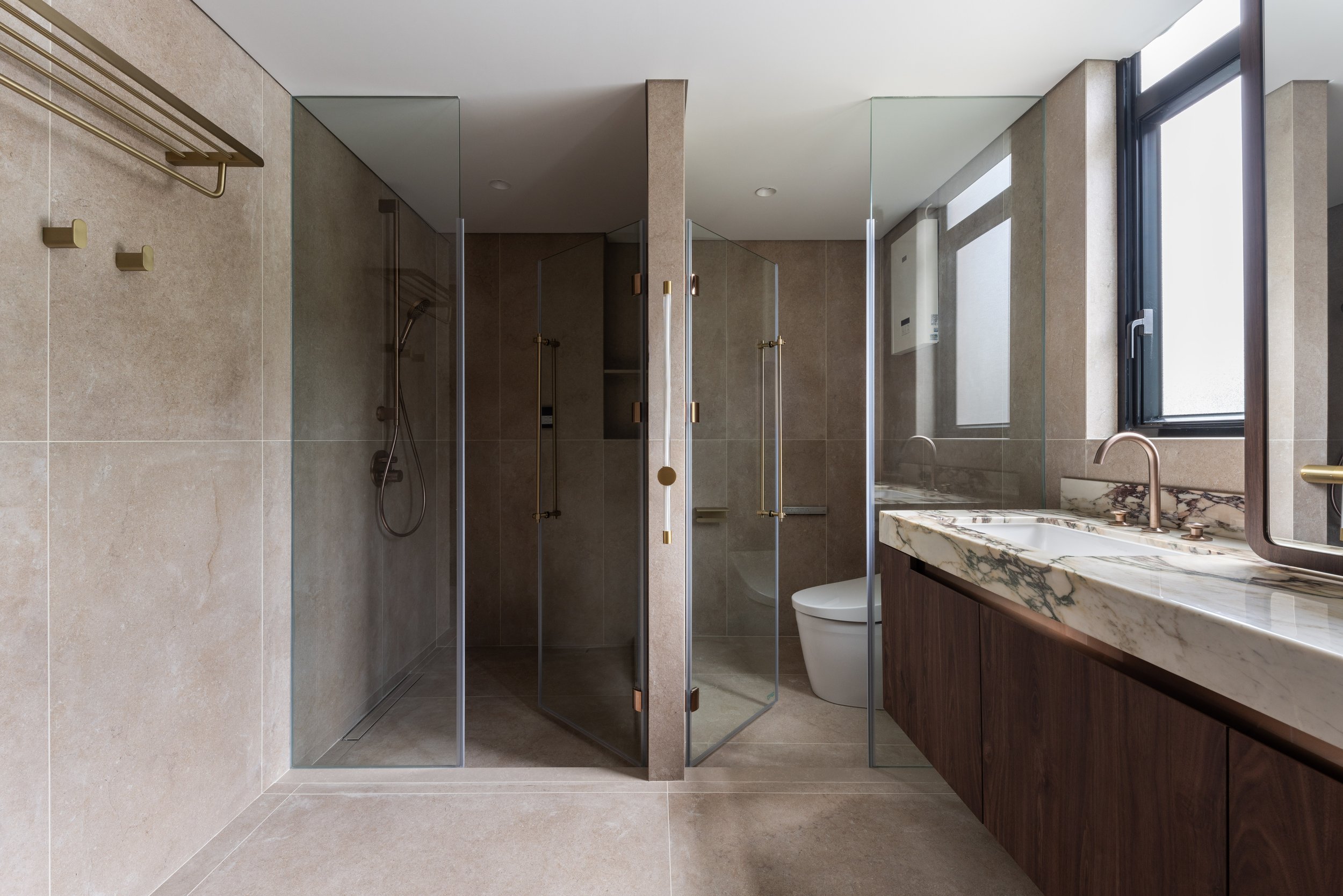
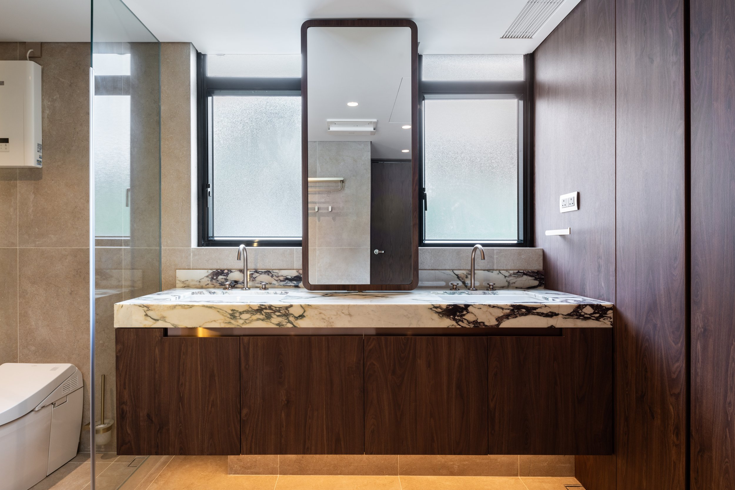
在主廁的設計裏,設計師選用了白色和灰色的磁磚去分割兩個區域,而且以玻璃鐵件圍塑的浴室和廁所,除了穿透感十足,亦都靈活地運用空間。而挑選玻璃門可以更明確地劃分開兩個區域和增加空間感。日光由特色壓花玻璃映照在灰階的地板上,創造視覺立體感。
The designer considered the key of bathroom decoration to be graceful which create a serviceable yet still attractive room. It was chosen snow and abalone colour tiles to divide the two areas and used glass and iron to enclose the bathroom and toilet. Consequently, it was penetrating and flexible in the use of space. The glass door was separated the two areas and boost the sense of space. In terms of luminosity, daylight was not only reflected by the embossed glass on the tiles, but also invented a stereoscopic design project.
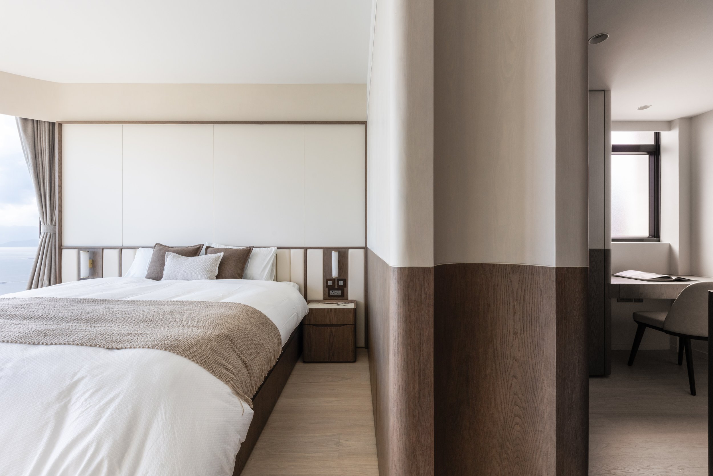
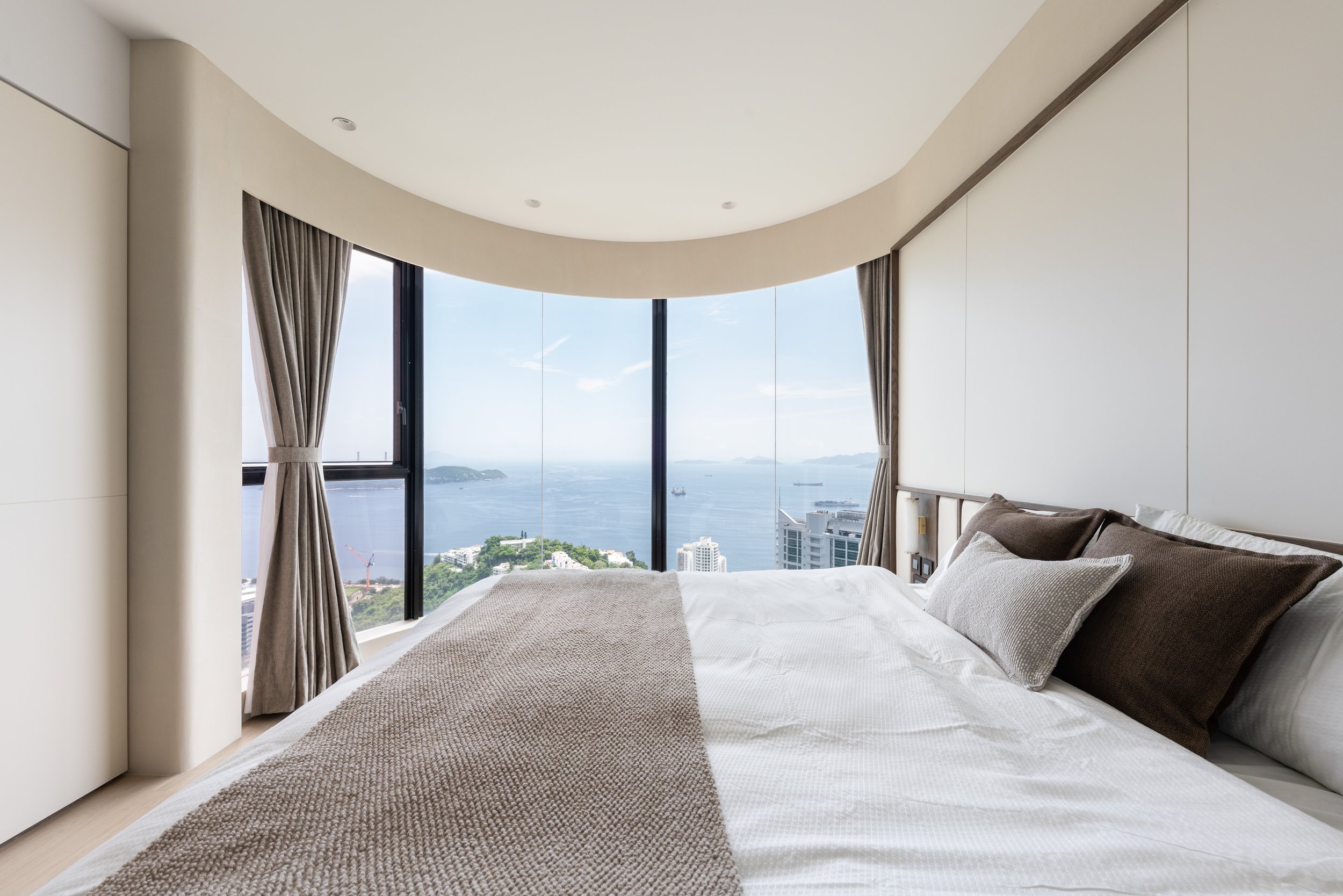
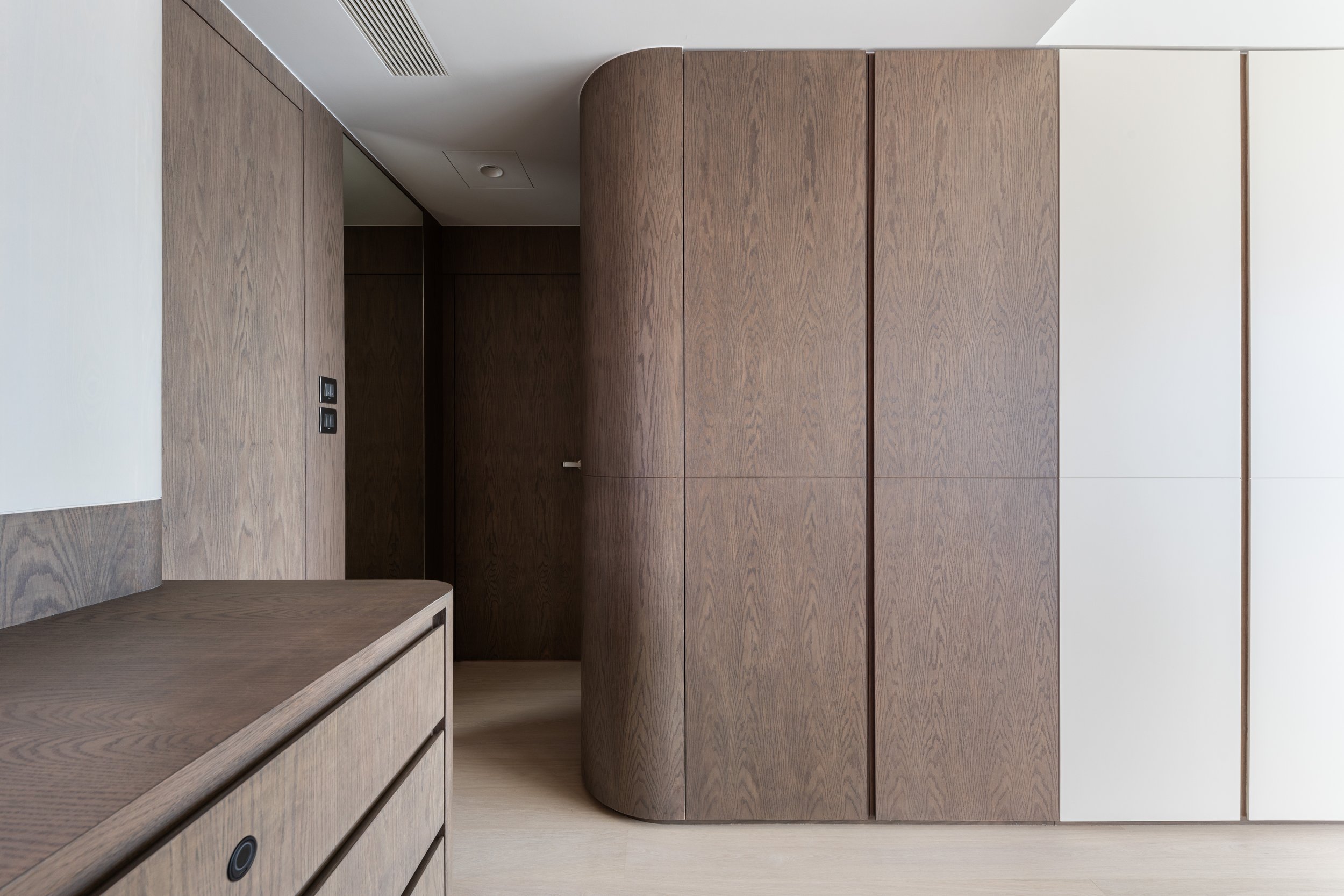

在主臥及客臥中,主要以鄉居色作房間的主調,並運用了簡單的黑色的線條修飾單調的牆壁,可見整體的空間變得俐落和形塑變化性十足的樣貌。另外,設計師巧妙地運用和牆身相同的顏色和物料讓衣櫃和周圍的環境融一體。暖色調的木質家俱讓冰冷的氣氛添上溫度,營造溫暖和舒適的環境。
Comfort, in all forms, is becoming more paramount, and is a significant concept of the master room and guest room. The colour of the thunder signified the sense of softness as well as the straight lines were used to decorate the monotonous walls, for instance, the space came to be streamlined and shapely. In addition, the designer used the same colour and material as the walls to make the closet blend in with the surrounding environment. Besides the design of the wall, the graft line wood furniture was altered to be a warm tone which devising a comfortable environment.
