
During the 19th century, Walter Gropius was committed to remove all 'unnecessary' ornamentations in its design, it has created a modernism 'less is more' movement which greatly influenced modern architecture and interior design.
Yet the design concept of this mid-level project seeks to bring back the timeless classical design such as Harrington bone floor patterns and wall mouldings in a contemporary way which we mixed contemporary and classical design elements, for example, thin wooden mouldings are applied very near wall edges to create a sense of 'New' classical design, these design elements has contributed in bringing a fresh new contemporary look for the timeless classical design which was once lasted for centuries since the Renaissance in the 14th century.
全屋以「花線」作語彙,為空間增添 現代X新古典 的元素。為避免過度的裝飾,花線的位置、粗細和比例必須準確到位,才能優雅地點綴各個空間。
首先映入眼簾的大廳,分為客、飯廳兩部份,共享相同空間卻不會過於擁擠。玻璃趟門裡,紅酒櫃、焗爐等煮食器具一應俱全,再往裡面走便是傭人的工作間,回到大廳那邊的走廊,藏著主人房、客房、還有兩個浴室,各有特色,同時亦能呼應整體的設計風格。
在用色上,選用了黑、白、灰 為主調,啡、綠、紅 作點綴,塑造舒適高雅而且有個性的家居。
所有用料和傢具均為外國進口及香港本地現場製造。
梳化:Cierre - Season
燈組:LADEUX - Pendant Classicon Selene
桌子:Poliform - Concorde Table
床組:Define - 2020 Design Maurizio Manzoni
The Grand Panorama .半山嘉兆台
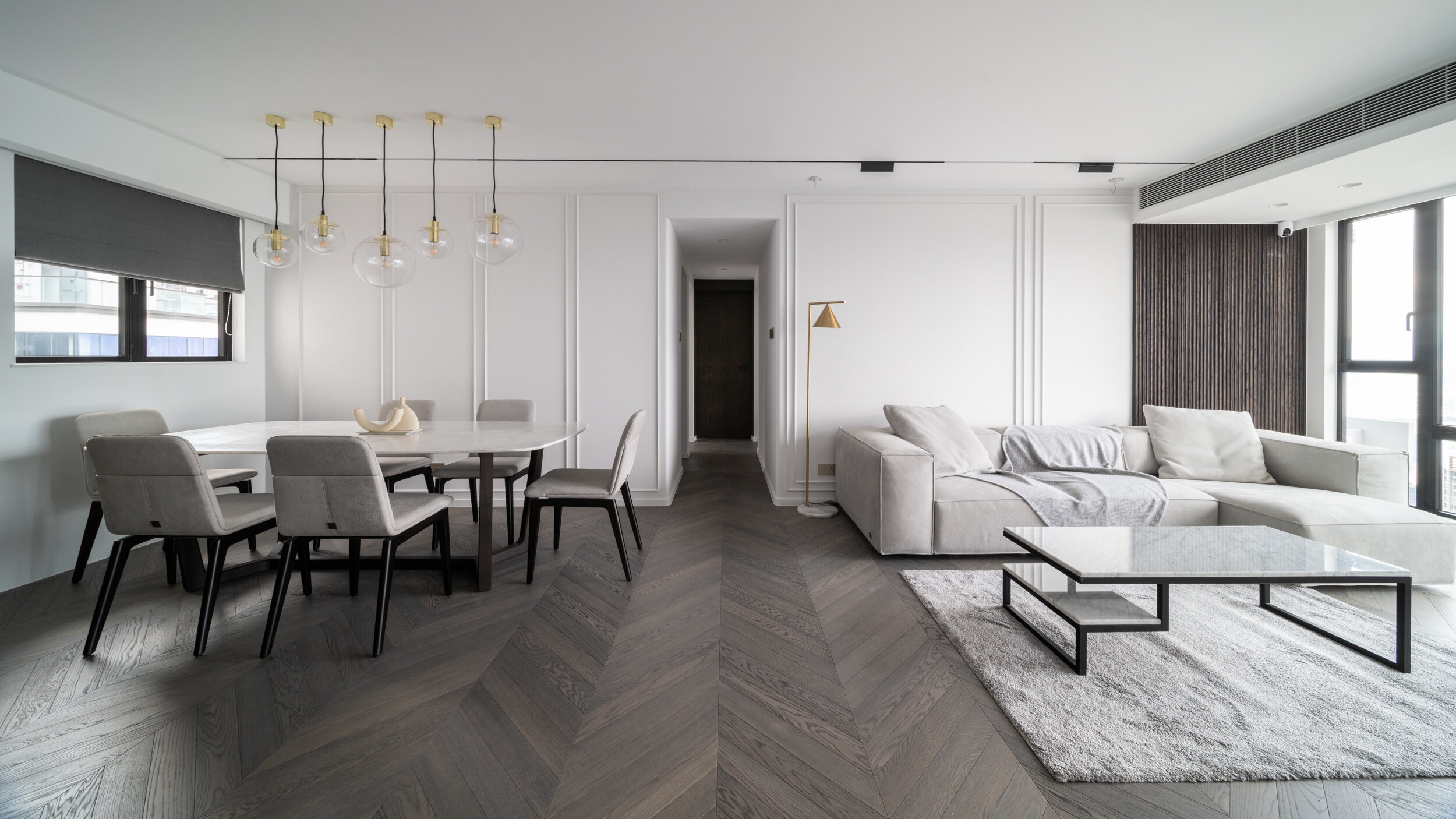
Sense of luxury.
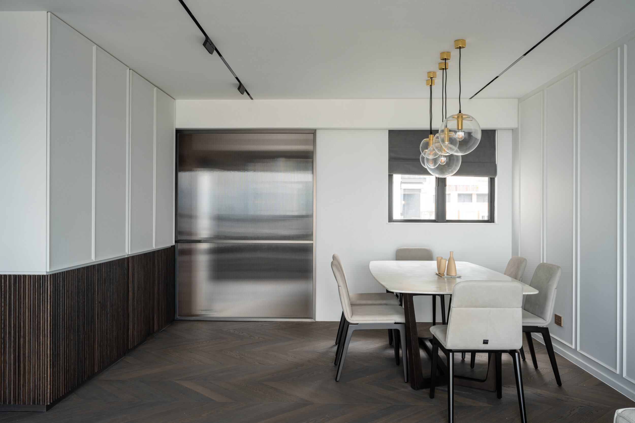
Classicon pendant lightings imported from Italy has brought the dining area to the next level of luxury feeling, just like its name, Classic-Contemporary, matches well with our design concept. Which bring back classical design element to the modern interior design.
The Classicon pendant lights were imported with different sizes and were placed at different levels to create an interesting combination.
Hidden light trough is a contemporary invention seen often in modern designs, we have embraced it into our classical design such as our wood molding ornamented wall panels. Of course, a touch of gold is the key to enhance the space with elegance.
飯廳使用從意大利進口的Classicon吊燈,經典的設計提升了飯廳的奢華感。而將經典的設計元素帶回現代室內設計亦是這次設計的重要理念。
設計師更通過將不同尺寸的Classicon 吊燈放置於不同的水平高度,能使它們在視角上創造出有趣的組合。
隱藏式燈槽在現代設計中很常見,因此我們也將其融入到我們的設計中。例如將它隱藏在我們的木紋裝飾牆板中,通過淡淡的金色光線能提升空間的優雅氣息。

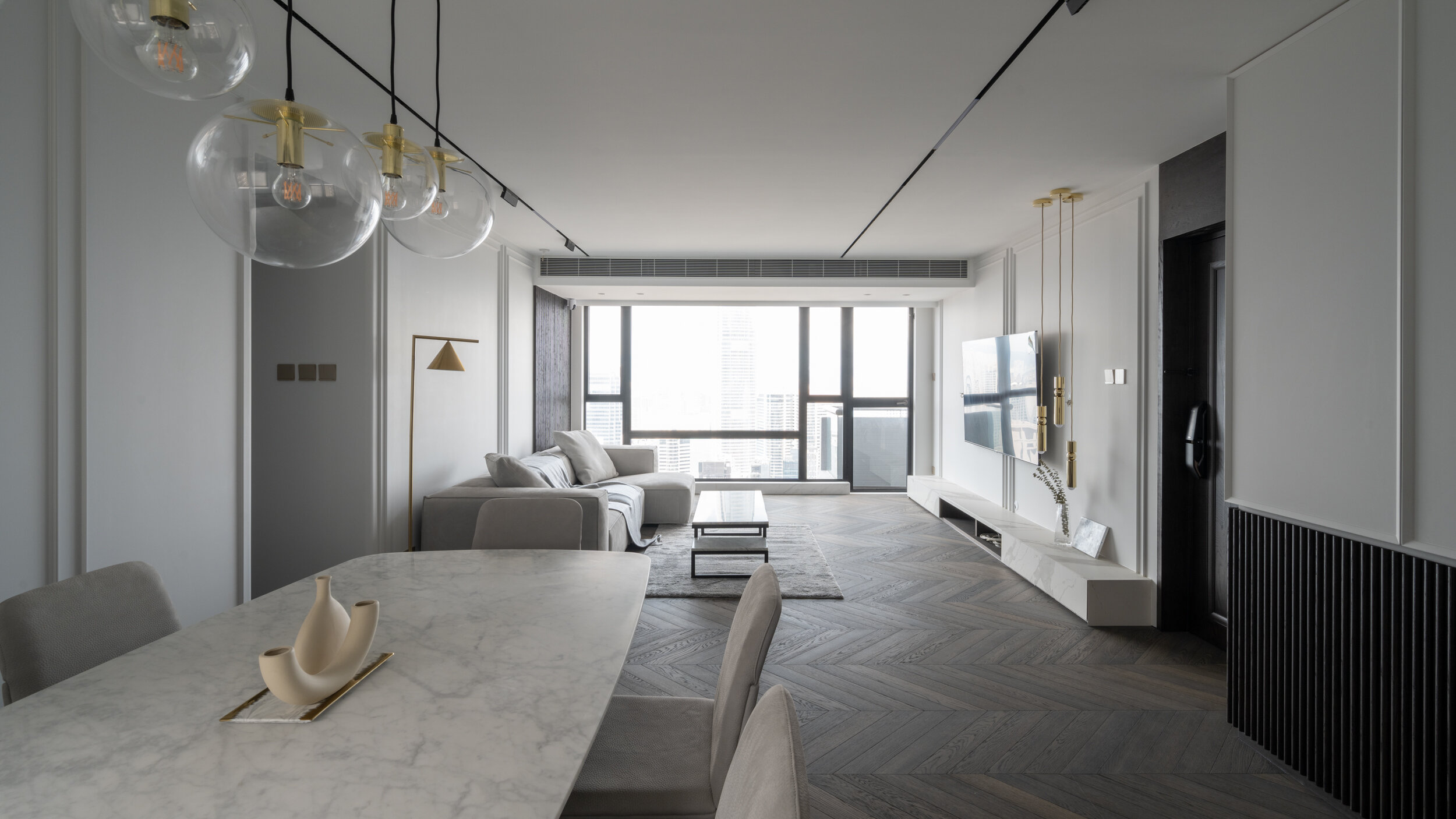
Continuously.
The TV cabinet is dressed with nano marble stone. To closes up seamlessly, the edge was treated at a 45 degree angle.
Double moldings is applied here at the back of the TV, note that the wood trims is disconnected at the louvre deliberately. So that it looks continuous and planes intersects visually making the feature wall looks even wider than it actually is.
For a 1400sq ft. space its better to use a duct type air-conditioner to sufficient cold air circulation, and it works well with the interior because its functionality is hidden smartly behind the louvre allowing other beautiful design elements to be much less distracted.
電視櫃採用納米大理石裝飾。 為了無縫閉合表面面板,電視櫃的邊緣以 45 度角接駁。
電視背面的特色牆,特意設計了貼近天花邊緣的雙花線,優雅地點綴整個空間。而花線特意在百葉窗處斷開連接。使牆壁看起來是連續的。特色牆看起來比實際更寬,增加空間感。
在 1400 平方英尺的空間,建議使用風管式空調以進行充足的冷空氣循環。而且它能夠巧妙地隱藏在百葉窗後,減少出風口對設計風格的影響。
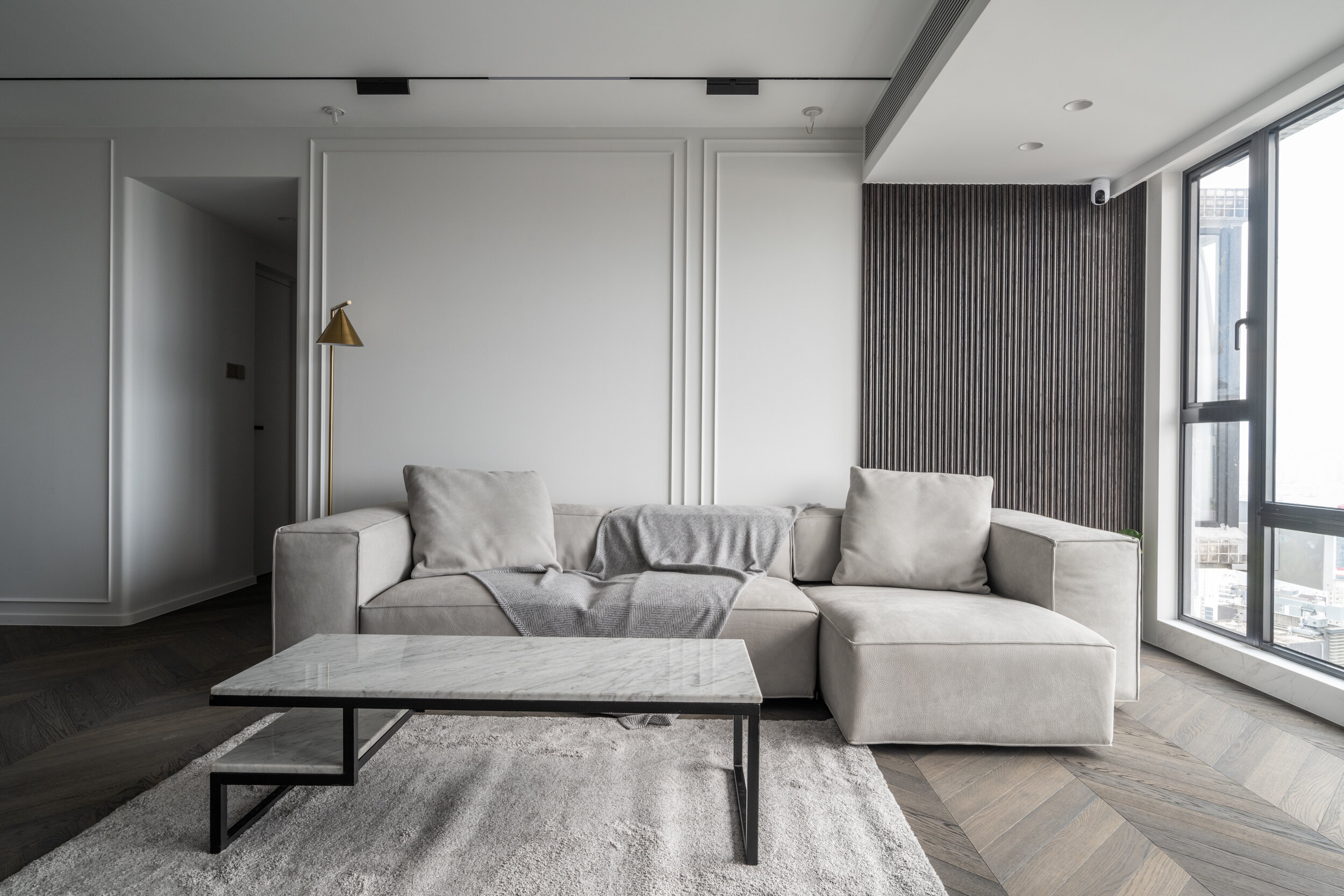
Attention to nature.
Attention to the nice texture of the carefully selected Nabuk Italian leather sofa resting together with a relatively subtle gray carpet and marble coffee table.
The Carrara white marble top echos with the white marble coffee table, also like that the Oak wood flooring showing its natural wood-grain texture beneath them.
Nabuk 意大利皮革沙發的柔軟質感,搭配精緻的灰色地毯和大理石咖啡桌,統一的色調增加空間的一體感。
Carrara 白色大理石檯面與白色大理石茶几相呼應。另一方面橡木制地板亦展現它的天然木紋紋理。
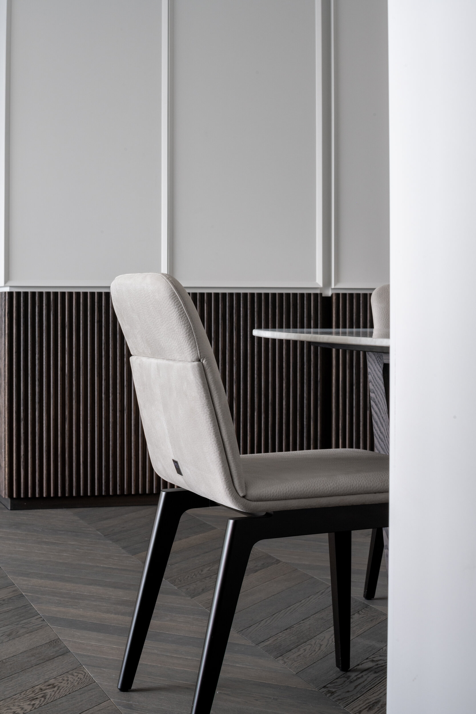
Dance with classic.
The choice of the classic Harrington Bone pattern made from Italian Oak Wood brand Corál has greatly enhanced the classical look of the space.
The Harrington Bone patterned wood flooring has proven to work very well with the reowned Poliform Italian table. Topped with matt Bianco Carrara marble top and the leather finished dining chair.
地板選用了意大利橡木品牌 Corál 製作的經典 Harrington Bone 圖案,大大提升了空間的古典質感。
Harrington Bone 圖案木地板與重新推出的 Poliform 意大利餐桌十分相配。與啞光的 Bianco Carrara 大理石檯面和皮革成品餐椅盡展自然材質的質感。


Art and craft.
A full height cabinet composed with solid wood strips beneath showed a great work of craftmanship. Strips made out of hard Oak wood of the cabinet were hand-painted on-site with OSMOwood wax.
由硬質橡木製成的櫥櫃條帶在現場用 OSMOwood 蠟進行手繪。這個由人工制作的實木條全高櫃子展示了一個獨特的工藝作品。

Enchanted with materiality.
Kitchen compose of natural hardwood of Walnut and matt black glass drawer panels, which almost never goes wrong with a wine cabinet.
廚房由天然胡桃木硬木和啞光黑色玻璃抽屜面板組成。玻璃抽屜面板的酒櫃使業主能從外面辨認酒的位置,方便使用。
Play with shape.
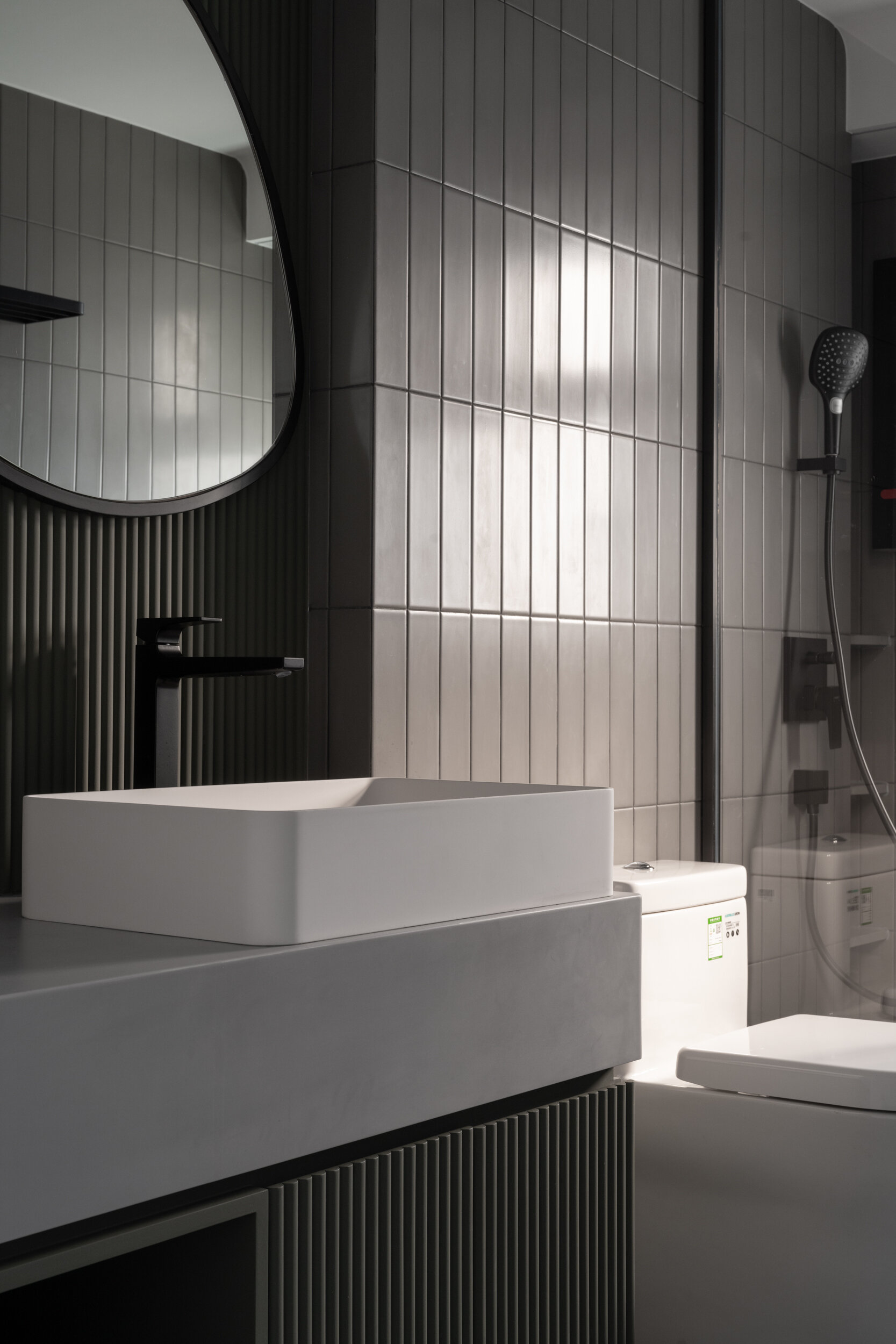
The mirror was a random shape hand-drawn on site which looks like a guitar pick with olive green strips as background.
Special Corian Gray color counter top lies on top the Antoniolupi wash basin.
鏡子是現場手繪的一個隨機形狀,看起來像一個帶有橄欖綠色條紋作為背景的吉他撥片。
特殊的可麗耐灰色檯面配搭 Antoniolupi 盥洗盆。
Space of childish.
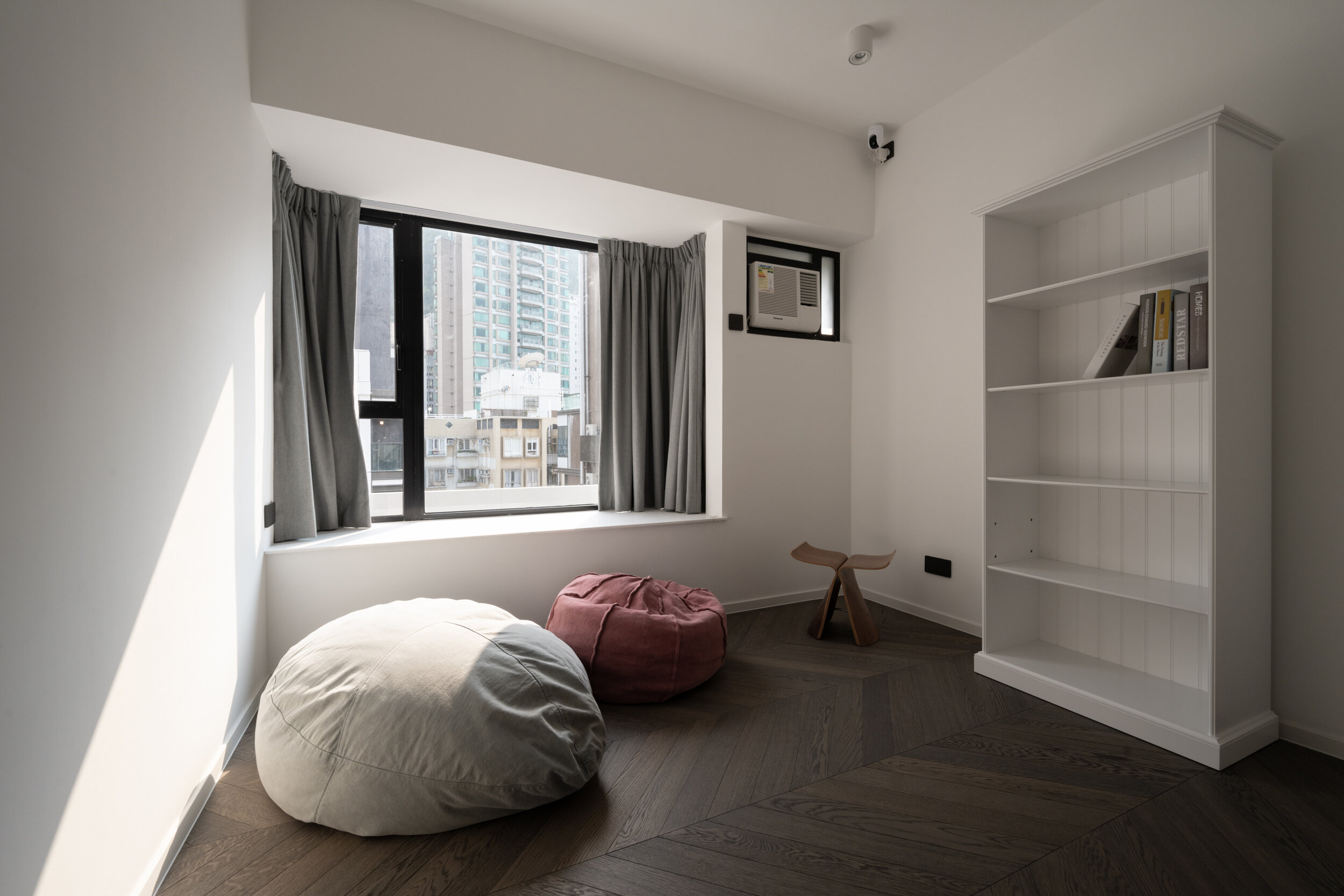
To leave kids design his own “playground” , we do not add much built-in furniture and left as spacious as possible.
為了讓孩子們設計自己的“遊樂場”,我們沒有添加太多的內置家具,儘可能地使房間保留寬敞。
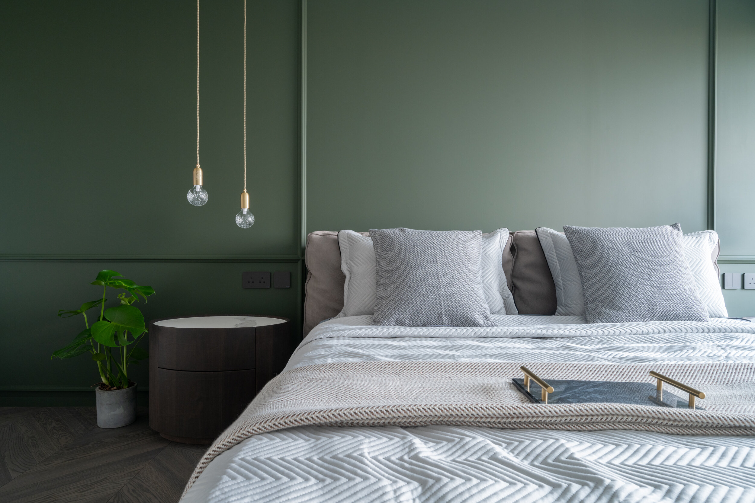
Amulet.
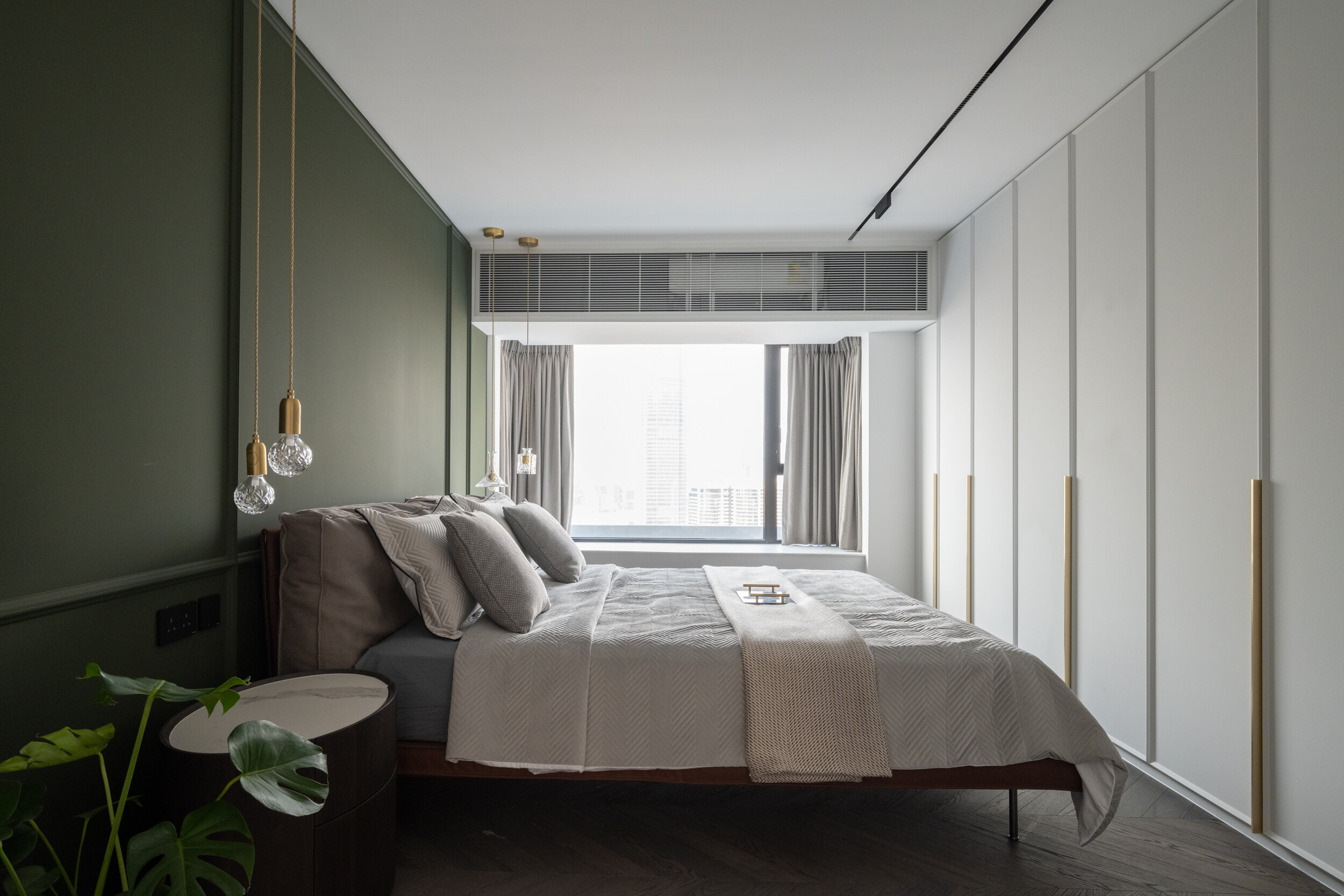
It is indeed an amazing oval-shaped bedside table, which took hours and days of hard work on-site. We develop design by craftmanship. The Crystal Bulb by Lee Broom floats like an amulet in front of our classic olive green wall panels.
這一個橢圓形床頭櫃在現場花費了數小時和數天的工作制作而成。Lee Broom 的水晶燈泡像護身符一樣漂浮在我們經典的橄欖綠牆板前。

Song of marble.
Great area of white marble pattern provide a light and clean feeling in the bathroom. However the continuous matching of the marble pattern was a challenge.
大面積的白色大理石圖案為浴室打造簡潔而明亮的感覺。 此外,大理石圖案在不同平面上保持連貫性,保障空間的一體感。
