
Interior Design for the Southen District, where a newlywed's home. A new arch element was incorporated into the design, where soft moldings symbolize their love, and warm tones hint at a bright future.
為一對新婚夫婦設計,以「花線」作為設計語彙的住宅,融合了新古典與現代風格,每一處細節都體現了溫馨與優雅。一踏入視野的大廳,巧妙分成客廳與餐廳兩個區域,既不擁擠又兼具功能,櫃內的獨特的大理石點綴成為標誌。再踏入私密空間,主臥、書房和主客浴室,各風格獨具,營造出一種和諧的浪漫氛圍,完美迎合新婚夫婦的甜蜜與夢想。
在用色上,選用了Timid White為主調,啡、灰 作點綴,塑造溫馨優雅而且有個性的家居。
所有用料和傢具均為外國進口及香港本地現場製造。
梳化:Cierre - Carlton B
茶几︰Poltrona Frau - Fidelio side tables
桌子:Calligaris - ICARO
餐椅:Calligaris - Oleandro
燈組:Giopato & Coombes - Bolle Pendant
床組:Poltrona Frau - Aurora Tre
壁燈:Parachilna - Bai A Di Di
Southern District · 南區
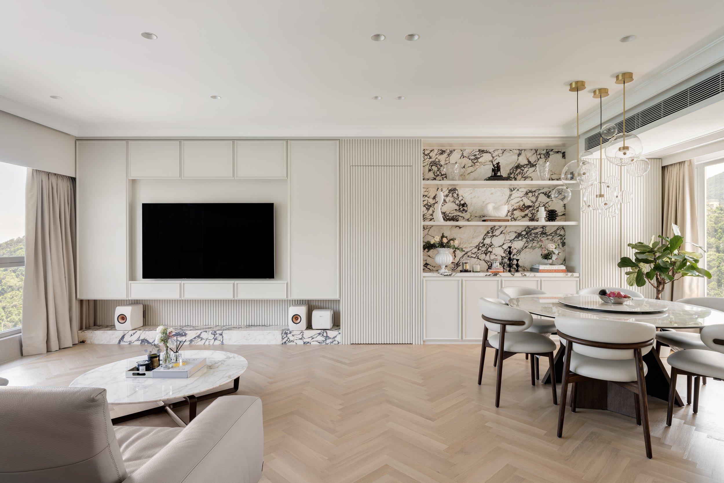
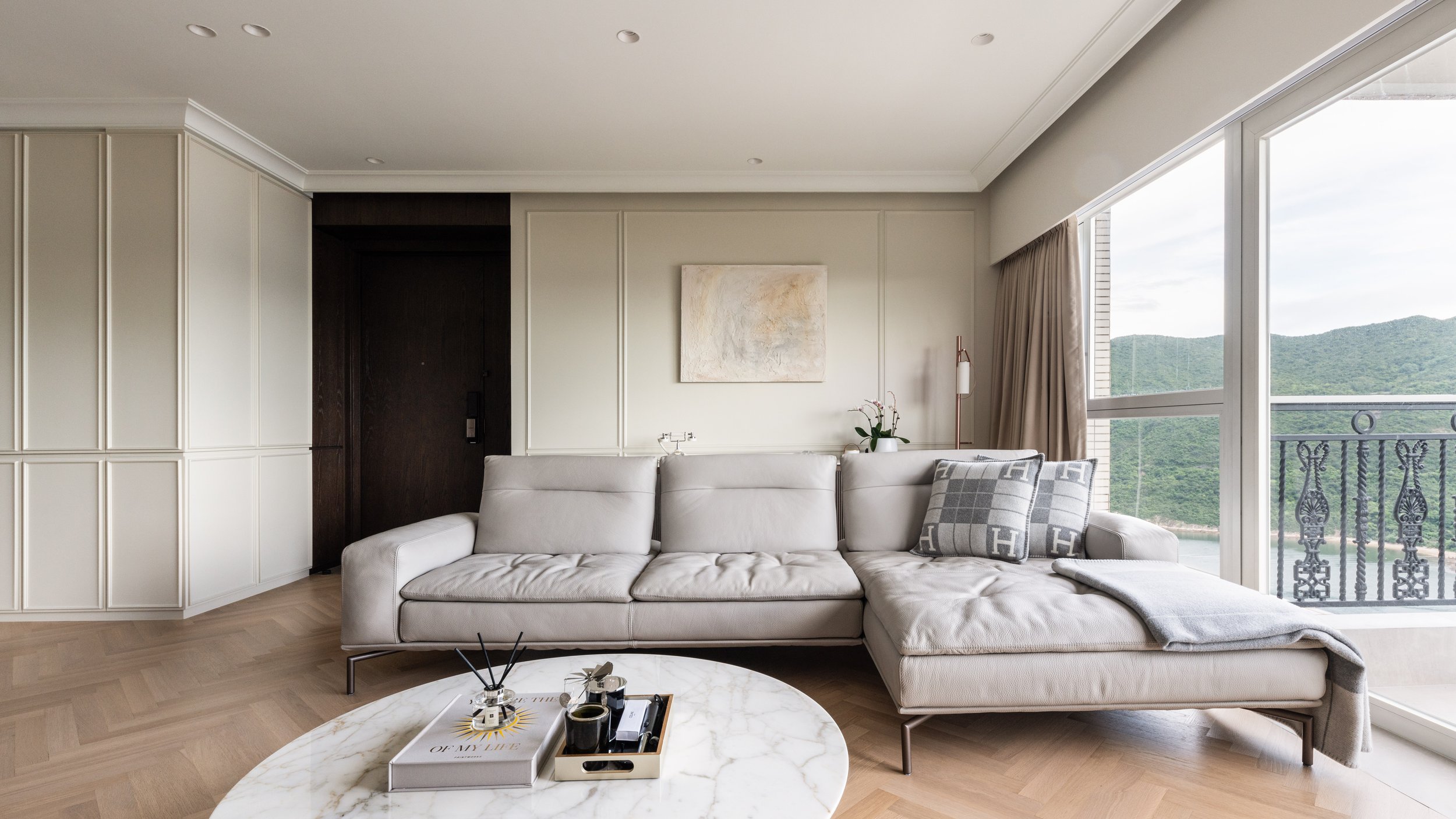
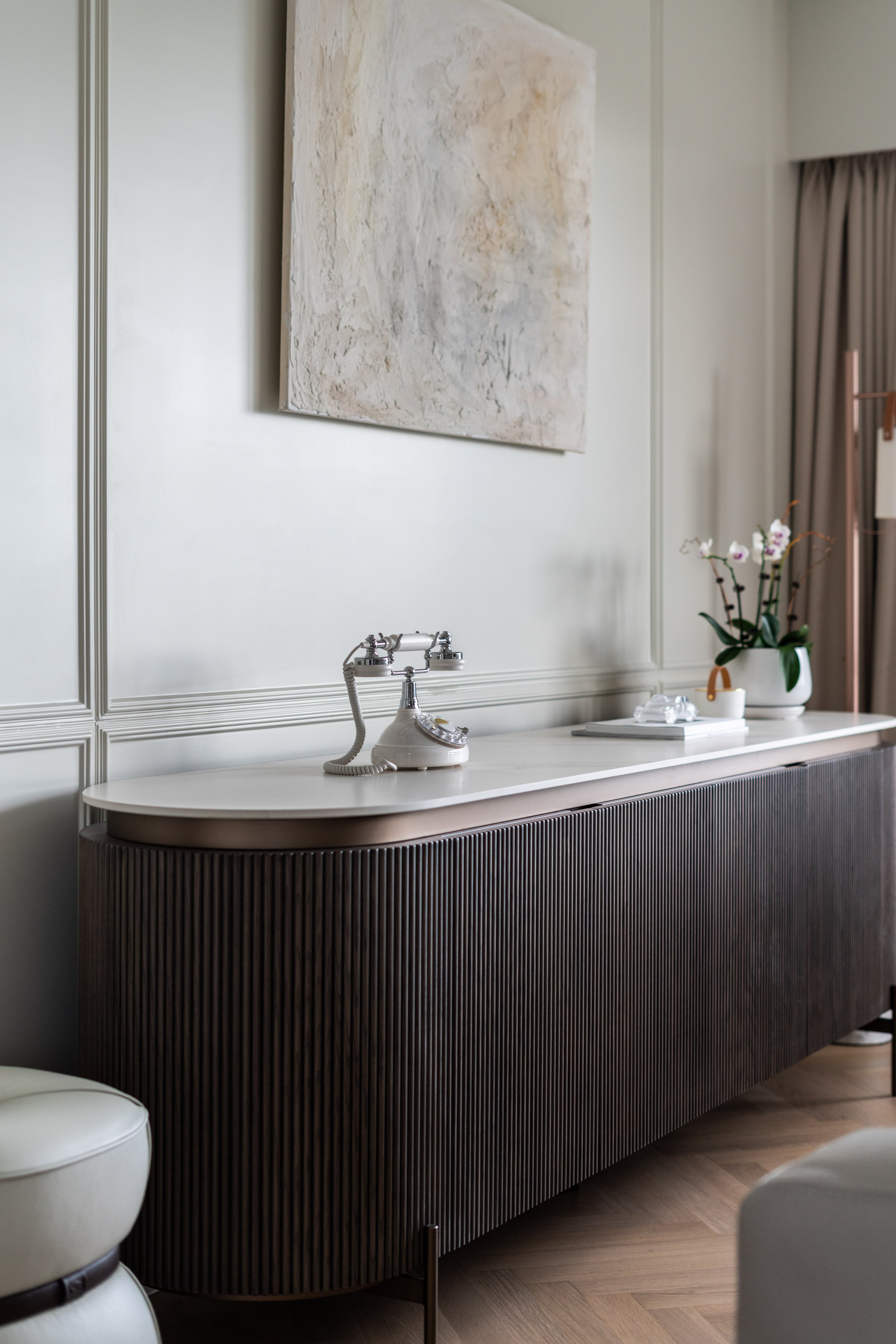
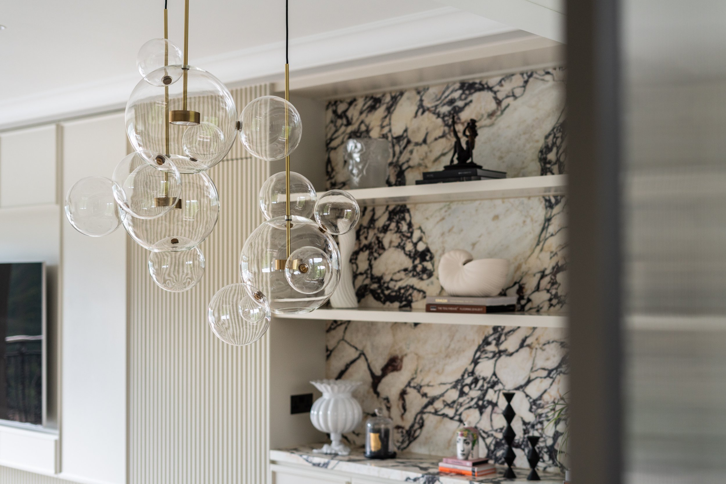
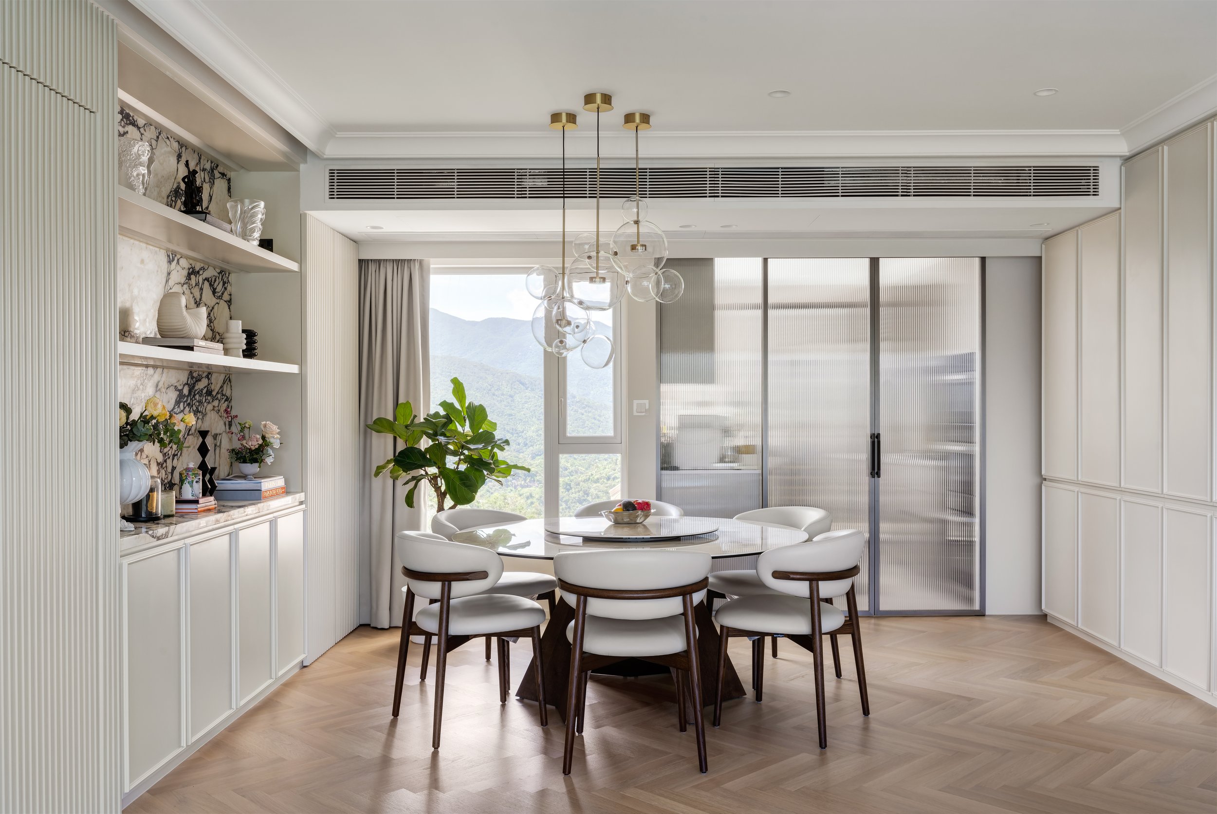
客廳以細膩的花線元素營造軸線分明的視角效果,令空間有更立體的視覺效果。以Calligaris 同色系的桌子及椅子作為一個棕色系的點綴,令客廳在色彩層次上更上一層樓。Giopato & Coombes 的吊燈亦為整體空間增添些許奢華感。
The living room is decorated with subtle mouldings to create a clear view of the axis, giving the space a three-dimensional visual effect. The Calligaris table and chairs share the same color are used as a brown accent to bring the living room to a high level of color, and the Giopato & Coombes chandelier adds a touch of luxury to the overall space.
電視下的油漆條子正好與沙發後的木皮條子櫃互相呼應。兩者雖然不同材質,但卻呈現出同一語彙。
The painted strip of paper under the TV echoes the wood veneer cabinet behind the sofa. Although they are made of different materials, they share the same vocabulary.


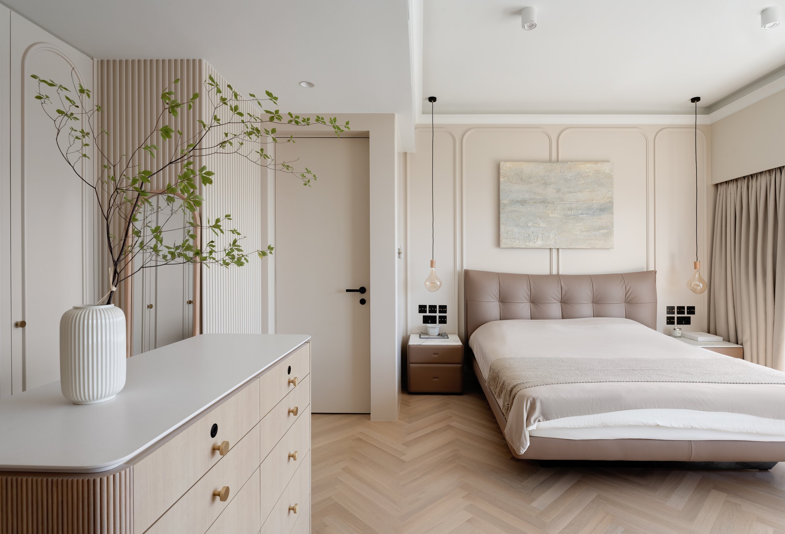

睡房使用了Vivid White 作為主色,再配合木色系家具,睡房整體感覺舒適又温暖。
Vivid White was used as the main color for the bedroom, and with the wood-colored furniture, the overall feeling of the bedroom is cozy and warm.
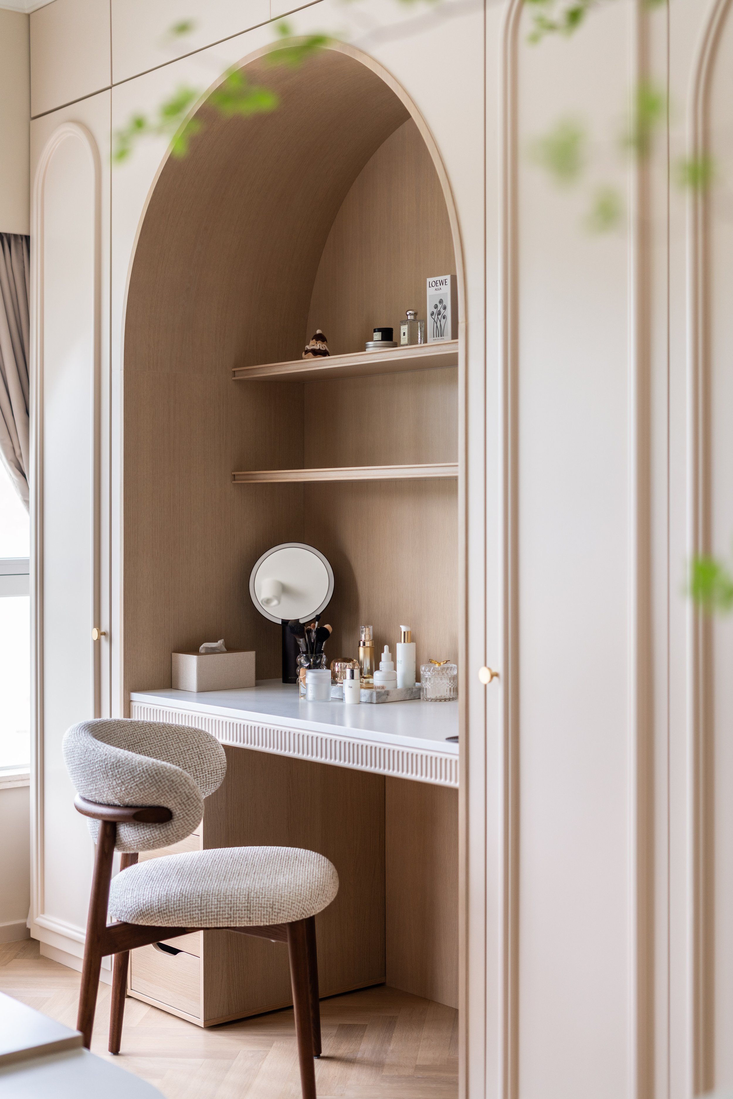
設計師希望當屋主凝聚在整個睡房的時候,他們可以把自己的生活投射到整個設計當中。譬如說,梳妝台以拱門設計是牆面花線的一個延伸,但當屋主開始使用時,會放上自己的物品,這樣一來,生活和空間之會產生一個關聯性,彼此會存在一個互動。
Our designer hopes that when the homeowners are united in the whole bedroom, they can project their own lives into the whole design. For instance, the archway dressing table is an extension of the moulding on wall, but when the homeowners start using it, they will put their own items on it, so that there will be a correlation and interaction between life and space.

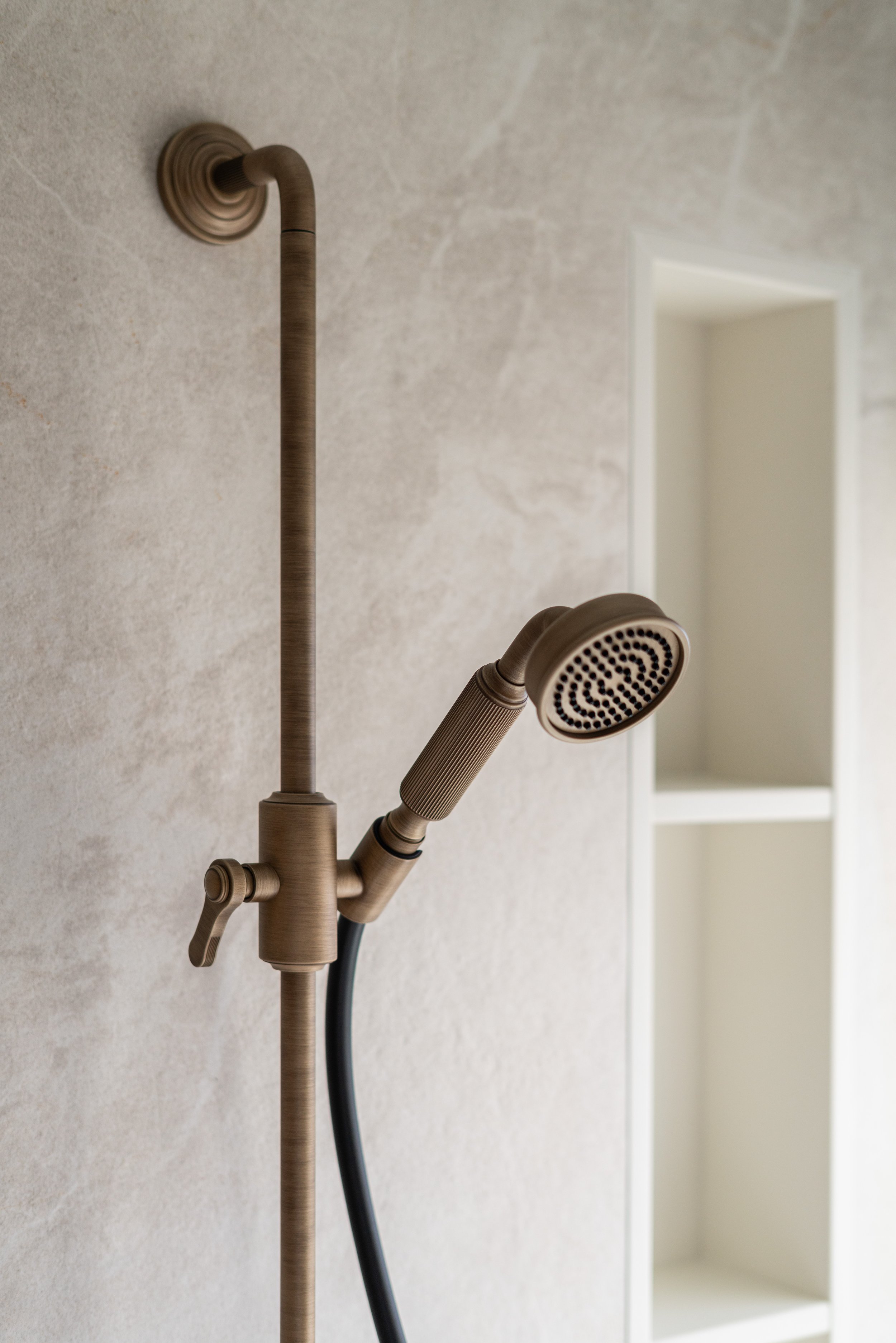
浴室整體牆身以Light Grey色調為主,以營造高級感,其牆身以及地板選用同一材質,整體感覺更為統一。
The walls of the bathroom are colored in Light Grey to create a sense of luxury, and the same material is used for the walls and flooring for a more unified feeling.
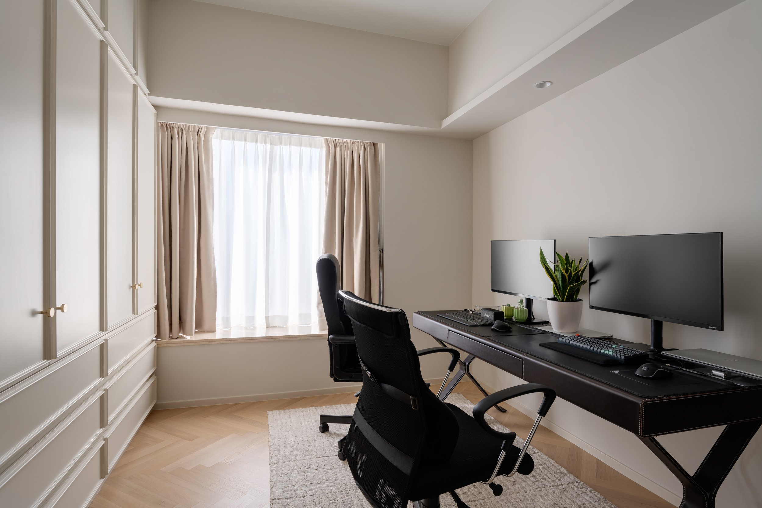
書房和嬰兒房同樣採用了帶有花線的暗格櫃,暗格櫃整齊地排列,乾淨俐落的感覺能令人更專心工作,同時也能騰空出更大的空間讓小朋友玩耍。
The study and the nursery both use concealed cabinets with moulding, which are neatly arranged and provide a clean feeling for people to concentrate on their work, while also freeing up more space for children to play.
